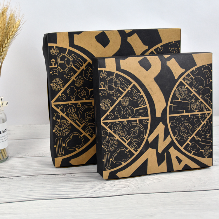
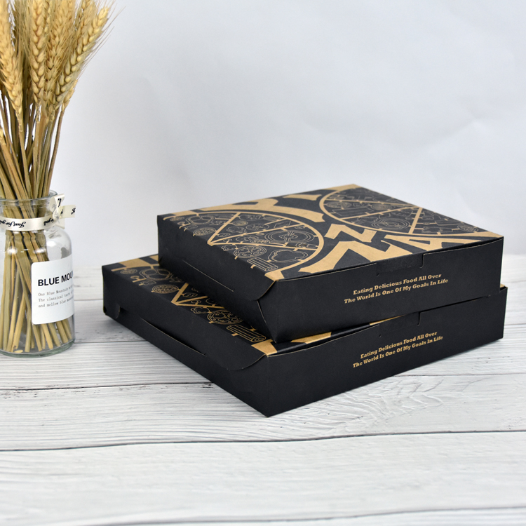
According to the inherent color of the product or the attributes of the product, the use of visual color is an important means of color box packaging and printing design. Commodity packaging is an important part of commodities. It is not only an indispensable coat for commodities, but also plays a role in protecting commodities, facilitating transportation, sales and consumer purchases, and is also a microcosm of the image of commodity manufacturing enterprises. As an important element in commodity packaging design, color not only plays a role in beautifying commodity packaging, but also plays a function that cannot be ignored in the process of commodity marketing. This is being paid attention to by more and more enterprises and the design of commodity packaging boxes.
On Food Packing Box, the use of bright and bright pink, orange, orange and other colors can emphasize the fragrance, sweet smell, taste and taste of food. Chocolate, oatmeal and other foods use warm colors such as gold, red, and brown to give people a fresh, delicious and nutritious feeling. The tea packaging is green, giving people a fresh and healthy feeling. The packaging of cold food products adopts blue and white colors with cool and snowy feeling, which can highlight the freezing and hygiene of food. Tobacco and alcohol foods are often used in elegant and simple tones, giving people a physiologically delicious and mellow feeling, and psychologically indicating that they have a long history of brand-name feelings. Clothing, shoes and hats are mostly dark green, dark blue, brown or gray to highlight the beauty of calm and elegance. It is the color of the packaging of these commodities that conforms to the physiological and psychological characteristics of consumers, so that consumers can quickly make a decision to buy this commodity among similar commodities, which will speed up the sales of corporate commodities.
The use of the color of the commodity itself to reproduce the color of the packaging can best give people the association of the same origin, and thus have an impression of the basic concept of the inner object. In commodity packaging design, color plays the role of a silent marketing master in commodity marketing because of its unique connotation, function and characteristics. This should inspire us as commodity packaging designers. Designers should not only pay attention to the beautification function of colors in commodity packaging, but also attach importance to their marketing functions in commodity packaging design from an economic point of view.
In the color box packaging industry, more than 80% of the information comes from vision. If the color box designer’s grasp and use of packaging colors can directly reflect a certain characteristic of the internal item, this kind of product is likely to become the first choice for buyers. Of course, there are also the opposite phenomenon. Some color box packaging design masters boldly use color contrast to achieve better and more strange effects, but if the proportion is not well controlled, it will be counterproductive.
Post time: Jun-14-2022